my little crafting world!!

Welcome to my little blog. hope you like what you see!!


I created this blog (albeit basic!) to have a reference for all the cards I have done.
Please feel free to take inspiration from anything, but please do not copy my designs, for any reason.

MyFreeCopyright.com Registered & Protected


Please leave a comment whether good or bad
so I know you have visited my little blog and I can then visit your blog!!


Thursday, 25 July 2013

Wedding Day card (commission)

hello friends. hope you are all well and not too hot with this back n forth weather. honestly I wish it would make its mind up!!

Today's card is a commission Wedding Day card with the theme of daisies. It was a last minute order so I hope I have done it justice.
I chose the classic landscape style as I think it looks stylish and is perfect for adding the flowers to the corner.

Here I have printed the sentiment and details onto some supersmooth stamping card and made a base card with a sheet of A4 folded in half. I matted the main section onto some lemon bazzil cardstock. 


 I printed the sentiment in a grey tone instead of black. I felt black would be too harsh with the lemon colour.

I made the daisies out of an xcut punch and added candi dots to make the centres of the daisies. green leaves cut with a martha stewart leaf punch. I then added diamantes for sparkle.


The butterfly was cut twice, once with the same lemon cardstock and then with yellow glittercard. Diamantes were added for his body and to make a line beneath him. 

 The ribbon was from my stash and you can see the bride and grooms names and date here.


This is the top left hand corner of the card. Again using diamantes for sparkle. (ignore the bits of fluff!)


This is the top section of the insert. With a daisy background printed in a lower transparency - I then printed the names with the date in the same font.


This is the bottom section of the insert. The sentiment printed out like before.


This is the front of the envelope. Again using the same font and this time a daisy in the bottom corner.


This is the inside of the envelope. (excuse the PC screen!)
I printed the bride and grooms names out and lined the inside of the envelope with the same paper and background as the insert. I like everything to match. I feel it makes it look more professional.

Would love to know what you all think. Good or bad. 

hugs till next time.
Rosie xxx 


Tuesday, 23 July 2013

Ruby Wedding Anniversary

hello friends
WOW!!! what can I say but a huge huge thank you to each and every one of you for not only leaving a comment on the cadbury purple wedding card but also the kind, caring and positive comments on my recent breakdown.  I am so overwhelmed by all the kind words - really helped me and cheered me up. And they couldn't have come at a better time for me.

Today I have another commission card to share with you all. This time for a Ruby Wedding Anniversary - 
I must admit I tend to stick with the same format and layout for the silver, golden and ruby anniversary cards as they are all well received.

Here is the main image of the card with the recipients details printed direct onto the base card in a ruby red font.


I like to use 2 different fonts - I feel it stands out more - here I have used a basic font called Baskerville Old Font and the swirly one is called Brock Script.

I embossed some matching base card into smaller sections with a little hearts embossing folder and matted them all onto red cardstock.  The double heart main die cut was cut on the cuttlebug with a little die I got a while back.


I think I might have to splash out on a new heart shape! I think the die cut sections are too noticeable. What do you suggest?

Here is the top section of the card.

Here is the bottom section of the card.
 
I like to put the date and the anniversary at the bottom part of the card. Just to make them stand out more.

The lady who asked me to make the card likes to write her own verses so this is what she got me to print out. Again its on a wedding insert paper. I feel this gives the cards more of a professional finish.


 Again the verse is written in the same main font as the front of the card and flourishes in the corners and all printed in the same colour too.
I also did the envelope like the cadbury purple one but silly me forgot to take a pic!

Thanks for sticking with me and dropping by today. I do hope you like this card. And I would truly appreciate any feedback - good or bad or any suggestions.

hugs to you all for being so understanding
love 
Rosie xxx


Friday, 19 July 2013

Wedding Day Card

hello friends
Firstly let me apologise as  I have been missing in action for a few weeks. thing just got a bit too hectic for me with work and life in general  - so I was told to take a week off work. I don't feel 100% back to normal yet but hopefully things will pick up for me soon.

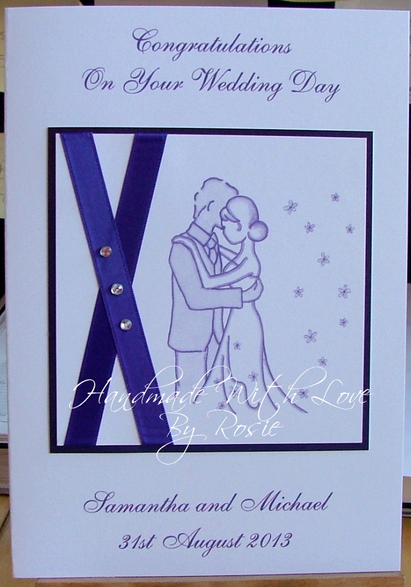
Anyway enough of me and my problems. I have a Wedding day card to share with you all today. This is a requested card from a regular card buyer of mine.

I was given the original evening invite and was asked to make the Wedding Day card in a similar style.  This is the invite below -

These were made for the couple by a company I believe. They were pretty small and not stuck together very well I'm afraid to say.

Anyway this is the card I came up with - 
Sadly I couldn't get the same width ribbon but it is the same Cadbury purple colour.
I printed the wording out on the base card which is a supersmooth thick card - I used a font called English Vivace and printed it in a purple font. I did the same for the image of the couple - I changed the outline colour to match everything else. 


I then matted this onto a cadbury purple cardstock.

I added 3 diamantes to match the original invite.   

This is a close up of the the top half of the card.


This is the bottom half of the card

This is the inside of the card printed on a wedding invite paper.


Here is a close up of the insert.


I like to match everything up - font style, colour etc. I feel it just makes the card look more professional.  I do the same for the envelope too.


Thanks for dropping by today. I would be delighted to receive any comments from you good or bad. 

Hugs to you all
Rosie xxx

Saturday, 29 June 2013

Happy Birthday sister

hello friends. 
Wow what a week of weather - hot, cold, wind, rain, and god knows what else!
Hope you are all well and enjoying yourselves.

Here is today's card. This is another requested card.

I was left to my own devices again with this one - so I chose this Bugaboo digi image called Dottie with cupcake.

I enlarged her to go with the size of the card A4 folded in half.

 The backing paper was printed in a lower transparency and wording printed direct from PC at the same time.


Here is a close up of the image. I coloured her with copics and added diamantes for sparkle and glamour dust with glossy accents to her cupcake.

Thanks for dropping by again. hope you like today's card.thanks for the comments on my previous posting. but I would just like to point out the card was not for my Granddaughter as I don't have any!

until next time
rosie xxx


Saturday, 22 June 2013

Digistamp boutique - Happy 9th Birthday card number 2

hello friends
as promised yesterday here is card number 2 for the little girl called Aliya.
This time around I have used a fabulous Digistamp Boutique image called Rosie Collection 1. 
As always she is coloured with my copics. I have added the name to the star shaped balloon using my Page Plus program.


I then covered the star shaped balloon with glossy accents for dimension.  The other balloon was covered with glamour dust for sparkle!


The background paper was from my digi stash and I dropped the transparency of it and then printed the sentiment across the top using a font called Allura.

I re-printed the image again and cut them out again to slightly decoupage them just for effect.


Apologies for the slight blurr on this photo but I hope you can see the presents.

I am entering this card into the Digistamp boutique monthly competition. 

thanks for dropping by again today. means such a lot to me

hugs to you all
Rosie xxx


Friday, 21 June 2013

Happy 9th Birthday - gorjuss image

hello friends.
hope you are all keeping well. I have been blog hopping some of your blogs for ideas and inspiration and am blown away by the standard of work being produced at the moment. You are all very talented!!

Here is today's card - I was asked to make 3 for the same girl but was given no information other than her name and age. So I chose these card themes myself. I just hope she likes them!

Firstly I decided upon one of the fab Gorjuss girl images from the same pack I received from my daughter for Mother's Day. 


I chose the background paper and printed the sentiment directly onto it using a font called Beautiful.


Here is a close up of the image with the decoupage. I don't think it needed any more - do you?

Thanks for dropping by and I will show you the other card tomorrow.

hugs to you all
Rosie xxx


Saturday, 15 June 2013

Congratulations on news of triplets

hello friends
wow can't believe a week has flown by again. I have been making Father's Day cards and as usual I forgot to take pictures. Note to self - TAKE PICTURES!!

anyway this card is a special request for a girl who has been told she is expecting identical triplet girls and sadly has has to leave work early. The play on words with the names at the bottom is thanks to her Scottish hubby who tells everyone they are having "3 Fanny's" excuse the pun, and play on his words. So I put 3 images on with 3 different spellings of the pun name.

Image is from Clip Art Fairy from ages ago. I printed out the babies and decoupaged their heads. 


 I printed the background paper from the same kit and printed the wording direct from the PC onto it before mounting onto an 8" square card.


I added a touch of glossy accents to their dummy's and glamour dust to the bibs.


Here is a close up of the names at the bottom of the card.

This is the left hand side of the inside of the card. I repeated the paper and baby image and left this side blank for all the work colleagues to write their names.

This is the right hand side of the inside. I printed the verse direct from the PC using a font called BaaHmk.

Here is the inside of the card. So you can see both sides.


I am quite pleased with how it turned out. 

I'd love to know what you all think. Whether good or bad.

Until next time. Have a fab weekend.

Rosie xxx